
Hierarchy Map
A Hierarchy Map enables you to visualize data hierarchically using ServiceNow tables' parent/child reference fields (if available). Additionally, a Hierarchy Map shows downstream related elements connected via CI relationships.
Launch Hierarchy Map
- Launch the Application Navigator and filter for a target table.
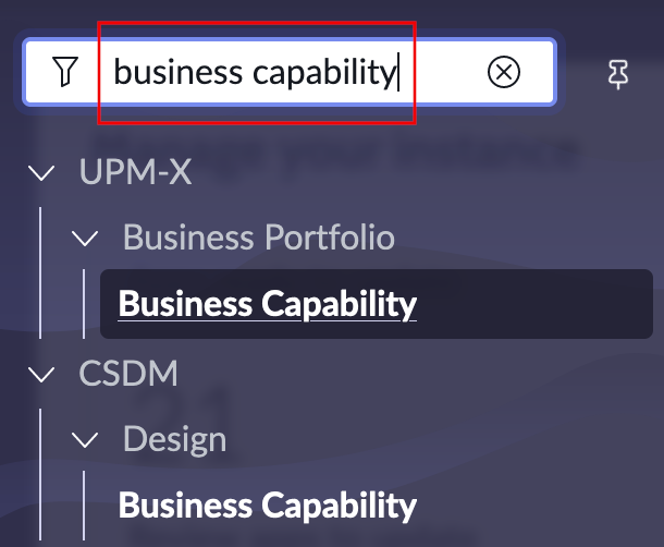
- Select the checkboxes for one, or multiple elements, to build a Tree Map.
- Scroll down and select Hierarchy Map.
Relationships in ServiceNow
Hierarchy Maps use the following ServiceNow elements:
| Element | Function |
|---|---|
| Parent/child reference field | Technically, this is a reference field called Parent in ServiceNow that refers to the table itself. This feature allows you to cascade data in a hierarchical structure. The hierarchy starts at level 0. An element of level 1 is the child of level 0, and a level 0 element is the parent of any level 1 element. |
| CI Relationships | All relationships within the CMDB & UPMX scope are stored within the cmdb\_rel\_ci table. Relationships have a base (starting) and dependent (ending) element. Two elements are connected via a relationship type which is defined as a suggested relationship. |
For a more fundamental overview on using visualization in UPMX, check out Edit Relationships.
Hierarchy Map UI Overview
The Hierarchy Map UI consists of three main elements:
- Hierarchy Map : Visualizations are rendered here.
- Overlay Menu : Provides quick access to main features including editing, export, fullscreen.
- Sidebar : The sidebar enables you to apply filters to visualization and change containers' background colors based on indicators. The Sidebar automatically disappears after 2 seconds. Hover your cursor over the visualization to reveal it again.
Quick Tip - Realtime IndicatorsRealtime Indicators allow users to color code data based on fields' values. These heat maps and visualizations enable target audiences to quickly identify risks and issues for further analysis.
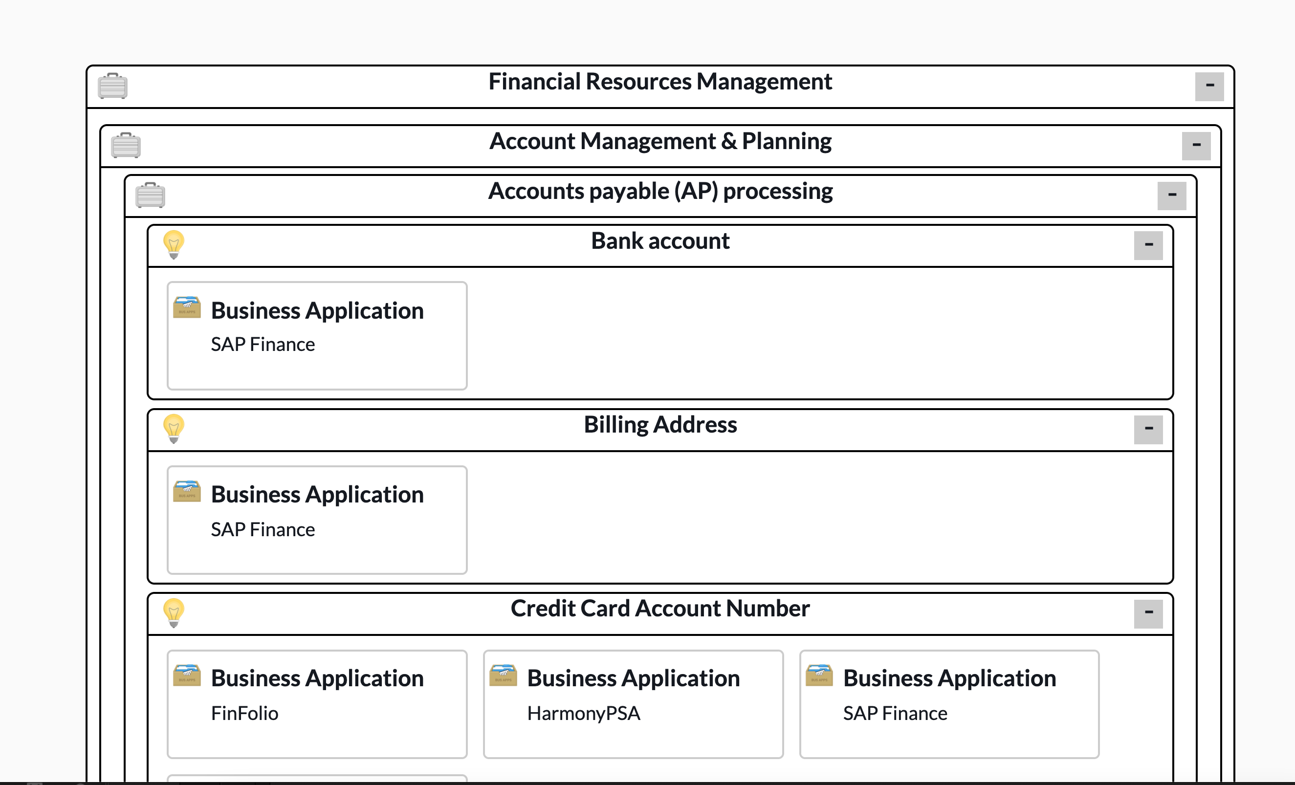
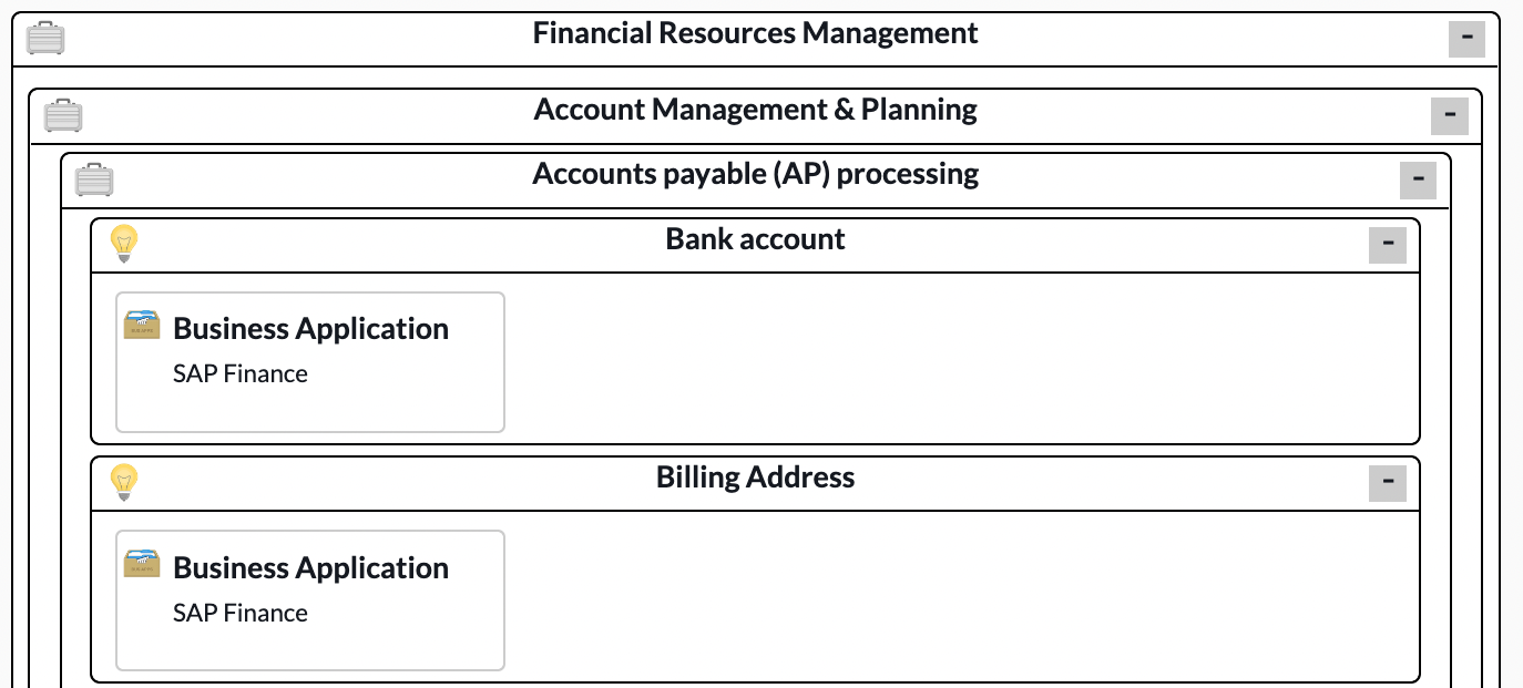
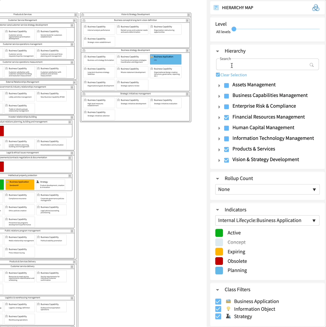
Hierarchy Map
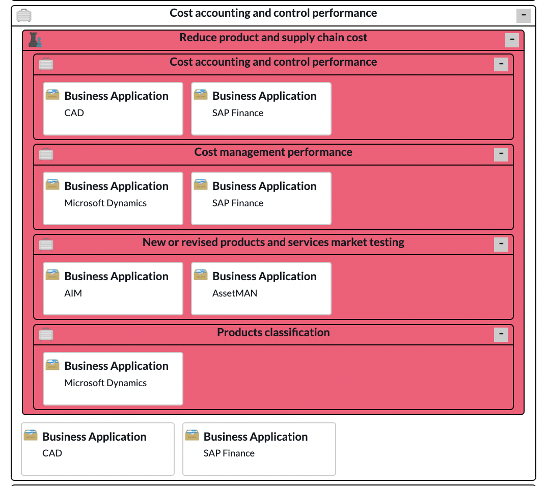
Hierarchy maps offer a great way to visualize complex data in an easy-to-understand format. The relationships between the objects are removed, and the content is rendered as nested containers. Each Hierarchy Map consists of the following elements.
Top Level Capability
- Level Capability: This view shows the top-level capability (level 0), i.e., the parent container with all child elements. This container has three levels.
- Rolled-up objects: This icon shows the number of rolled-up objects. You can adjust the rollup count in the Sidebar.
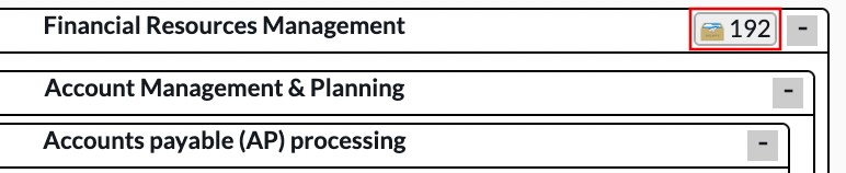
- Collaspe button: You can select the open/close button to hide or reveal the table's contents.
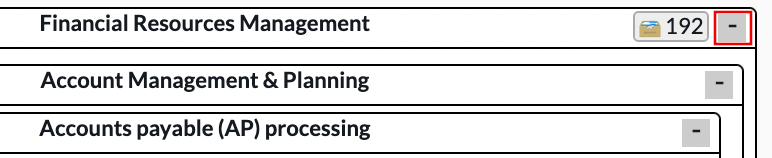
Table elements
Each table consists of the following elements:
- Icon : An Icon associated with the table.

- Table name : A table name for each Node in each container
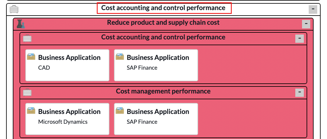
- Element name : Name associated with each element
- Colored Realtime Indicator (optional) : You can select a color for the containers and nodes in the Sidebar.
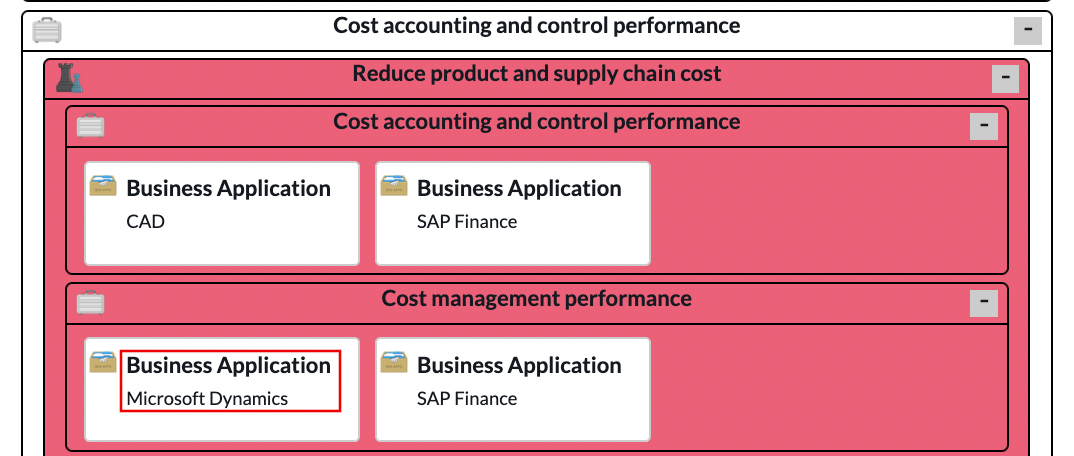
Right-click on a node or container to access its form view in ServiceNow.
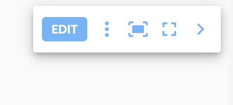
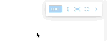
Overlay Menu
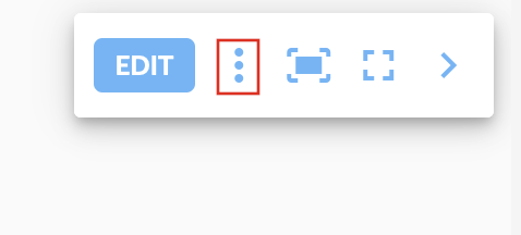
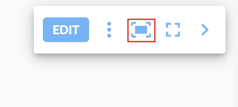
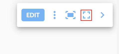
The Overlay Menu has the following features:
- Edit button : You can toggle between static and edit mode by selecting the edit button
- Options : Select the options menu for the option to export the visualization as a PNG file.
- Scale to fit : This feature scales the visualization to fit your screen's width.
- Fullscreen : Triggers your browser's full-screen mode, expanding the visualization to fill the entire screen.
- Toggle Sidebar : Select this button to collapse the Sidebar
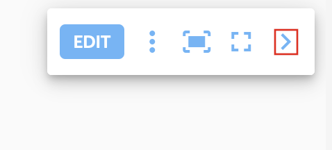
- Add new Node : (Only available in edit mode) select + to add new nodes. Refer to Editing Mode for more information.
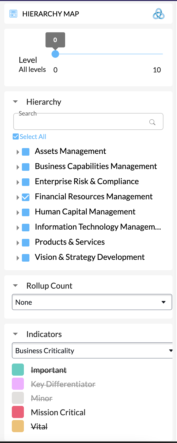
Sidebar
The Sidebar contains various widgets to change the visualization content.
Level Selector
Use the Level widget in the Sidebar to collapse containers.
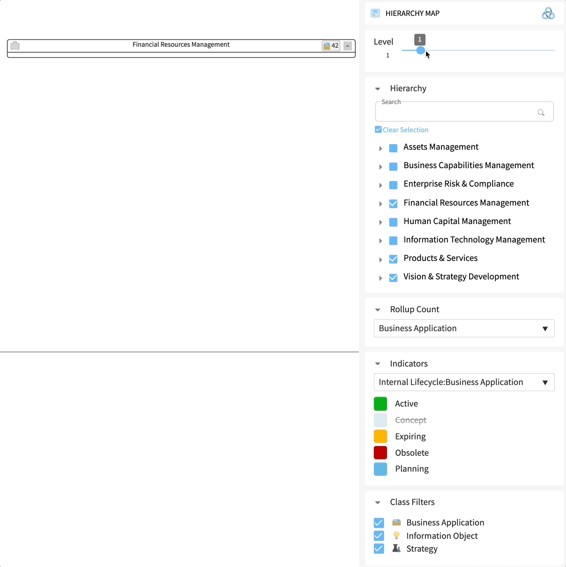
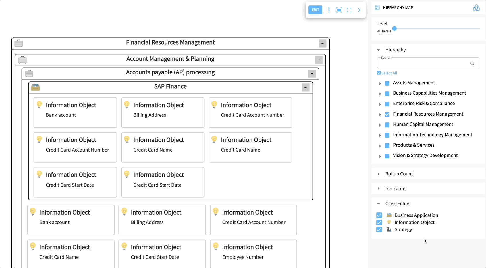
Hierarchy Selector
The Hierarchy widget allows you to search within the hierarchy tree and select/unselect elements within the hierarchy.
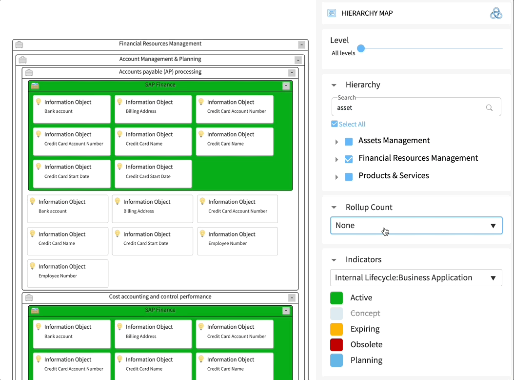
Rollup Count
The Rollup Count widget allows the ability to count all elements (Node) within the hierarchy and visualize it with a number on the level 0 container.
Click on the rollup count number to see a list of nodes.
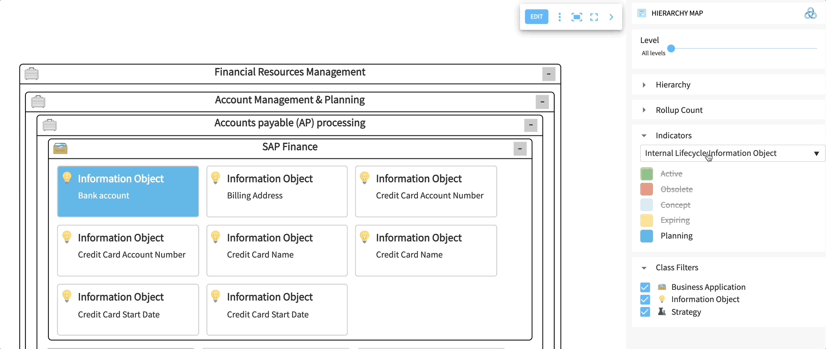
Indicators
Realtime Indicators allow the user to color data based on any field value. The resulting heated maps and visualizations help the target audience to identify risks and issues for further analysis.
Select a defined Indicator from the Indicator widget within the Sidebar to color nodes and containers of the hierarchy map. You can select the labels to hide/show the corresponding nodes and containers in the hierarchy map.

Class Filters
Class Filters help you to quickly remove a specific object type (table) from the hierarchy view.
There are two primary functions:
- Hover over a table name to highlight the nodes on the hierarchy map.
- Click on a table name to unselect and hide the nodes from the hierarchy map. Click on the table name again to select and show the nodes on the hierarchy map.

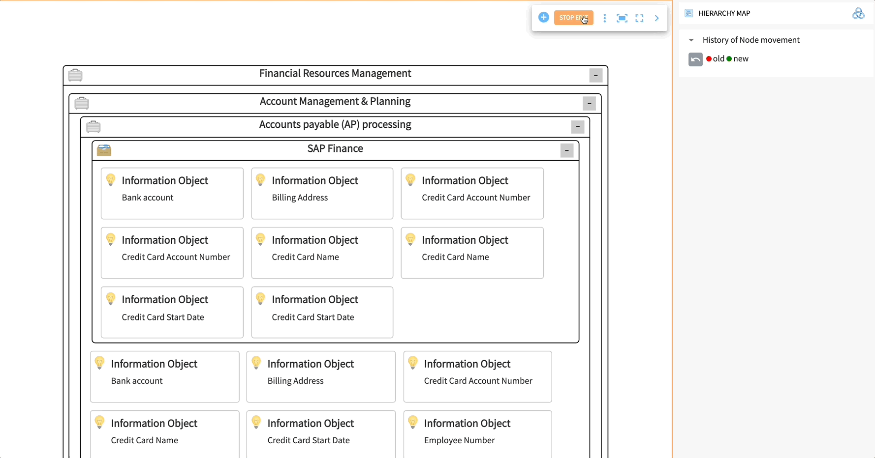
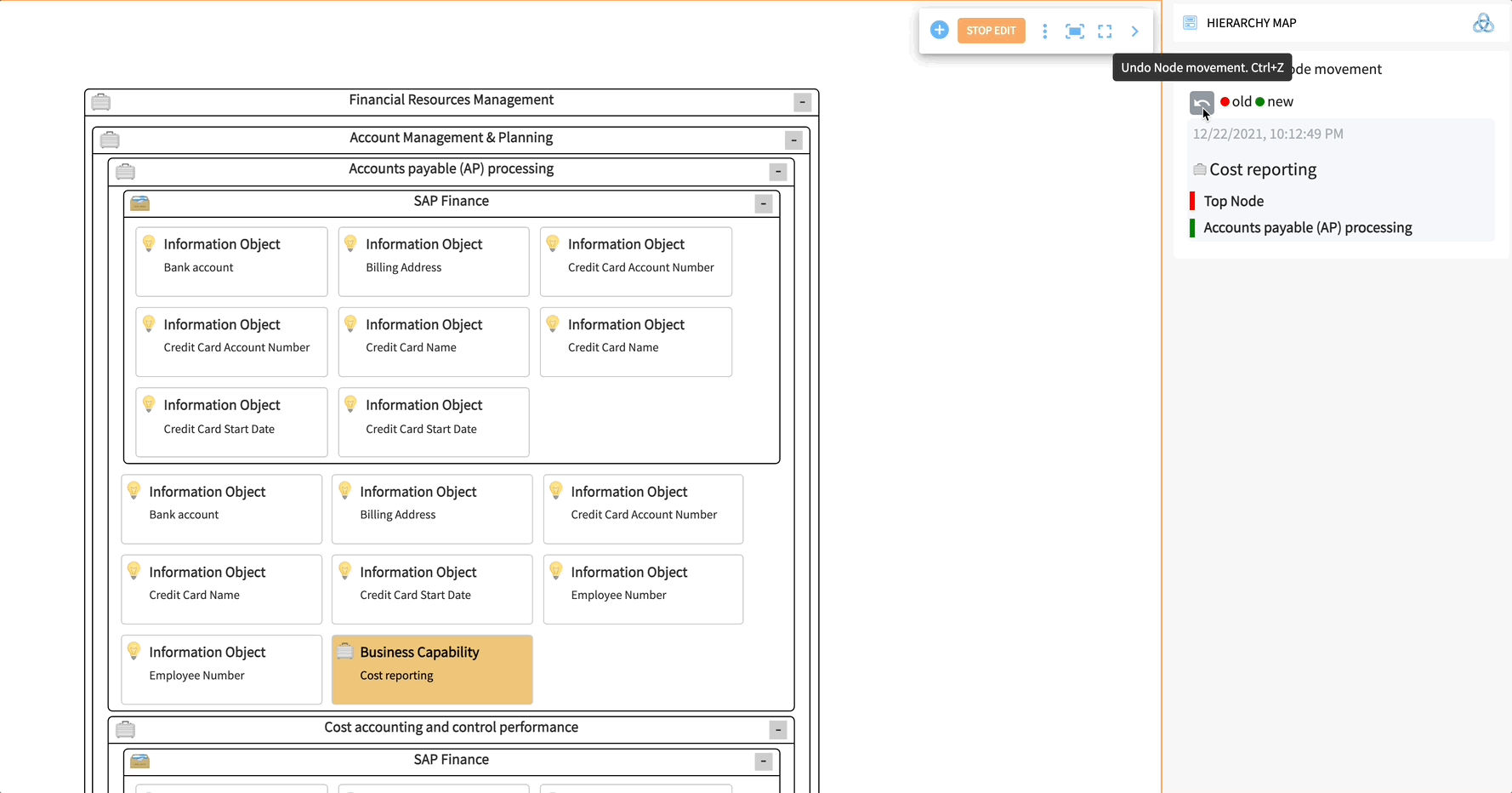
Editing Mode
A core feature of Hierarchy Map is the Edit function.
Creating a new Node
Clicking the Edit button will enter the editing mode, so you can add new nodes to the hierarchy map (see point #6). Once the editing mode is entered, the edit button changes to Stop Edit. Click "Stop Edit" to leave the editing mode.
Note that the filtering options in the Sidebar will disappear, and the history will appear.
Now, click the "+" button and enter a Name. Click the Create button to create a new Node.
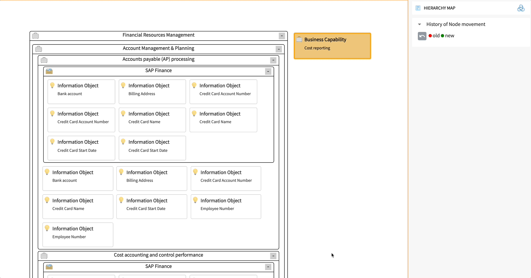
Moving a Node via drag & drop
Drag the newly created Node and move it to the target position. Drop it at the hierarchy position where you want to add it as a child or parent. Of course, you can change the hierarchy levels for any node of the starting table.
Undo changes
The History of Node Movements in the Sidebar is visible during the edit mode and will show you the recent movements done.
Select the arrow button to undo the change.
Please note that the creation process is permanent.
Updated about 1 year ago